I don’t know you, but I spent the winter thinking about the end of the CWB marketing monopolies, about the new selling and contracting regimes for grains, about new grain futures and newly relevant old grains futures, and about – most recently – the Glencore takeover of Sask Pool. Or whatever they renamed it a few years back.
Because of all that, I haven’t spent nearly enough time thinking about or writing about the structure of the big markets. That’s too bad, because it’s been a fascinating time and a weird time and an unsettling time and a happy time in the world equity, commodity, bond, currency markets. The changes within the grain industry in Western Canada are very important for every farmer, but in reality, the overall level of the commodity markets is far more important because that’s 95 percent of the price farmers get. The other stuff – CWB vs no-CWB, futures-based markets vs flat price cash markets, contracts with AoG vs no AoG – supplies the other five percent.
So what’s going on in the superstructure of the markets, in the rebar that provides the support for crop prices? The best way to look at some of the weirdness in the markets now is through charts, as always, so here are a few. I’m not going to draw any conclusions here today, because I’m just reacquainting myself with the overall world mega-market situation, but there are some pretty curious pictures below:


To me the straight, straight, straight line of the stock market advance is beautiful, bizarre and utterly unlike the kind of volatility we’ve experienced since the mid-2000s. Have we moved into a new era? A new golden age? Or are we about to get a slap in the face? That kind of general, unblinking rally suggests to me comfort and complacency, but perhaps it is time to “Don’t worry, be happy.” That’s how the markets are taking the world economic situation, anyway.
Interesting to look at the CRB chart. There is no linkage between commodities and equities now. In orthodox theory, there generally shouldn’t be, but orthodoxy has not ruled since the mid-2000s. Generally commodities and equities have been married, for both good and ill, as the minister suggested they should be. So seeing commodities charts looking so different to equity charts makes me wonder again if we’ve passed into a new age, or are just in a brief period of relaxation and euphoria.
Read Also
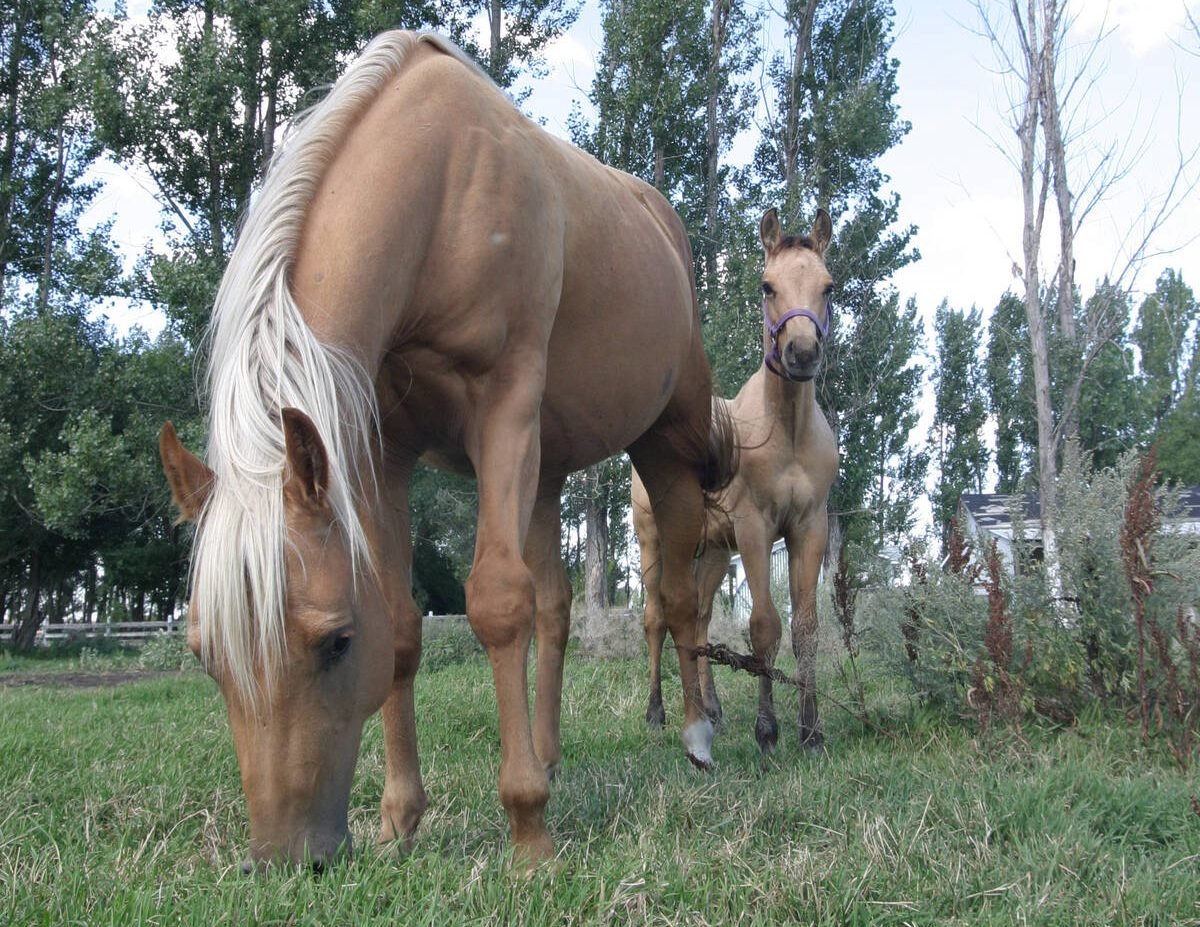
Growth plates are instrumental in shaping a horse’s life
Young horse training plans and workloads must match their skeletal development. Failing to plan around growth plates can create lifelong physical problems.
Canola and soybeans echo the equity advance. Are they connected? Corn and wheat do not reflect the equity advance. Does that mean something?
Like I said, I’m not going to provide any guesses here to the technical nature of the situation today. But I’m going to get my little head thinking about it. And I’ll call some people who can make some confident-sounding guesses. I will refer to them as “analysts.”