
Here are some charts that tell pretty interesting ag commodity stories. The first was produced by our markets editor, D’arce McMillan, while we were sorting though all the StatsCan Seeding Intentions report stuff. Check out the numbers on the table and the lines on the chart that show the same thing: farmers on the prairies have steadily upped their acreage of canola and generally reduced their planned acreage of spring wheat over the past decade. And as seeding goes on, farmers add more acres to canola and cut wheat acres.
Read Also
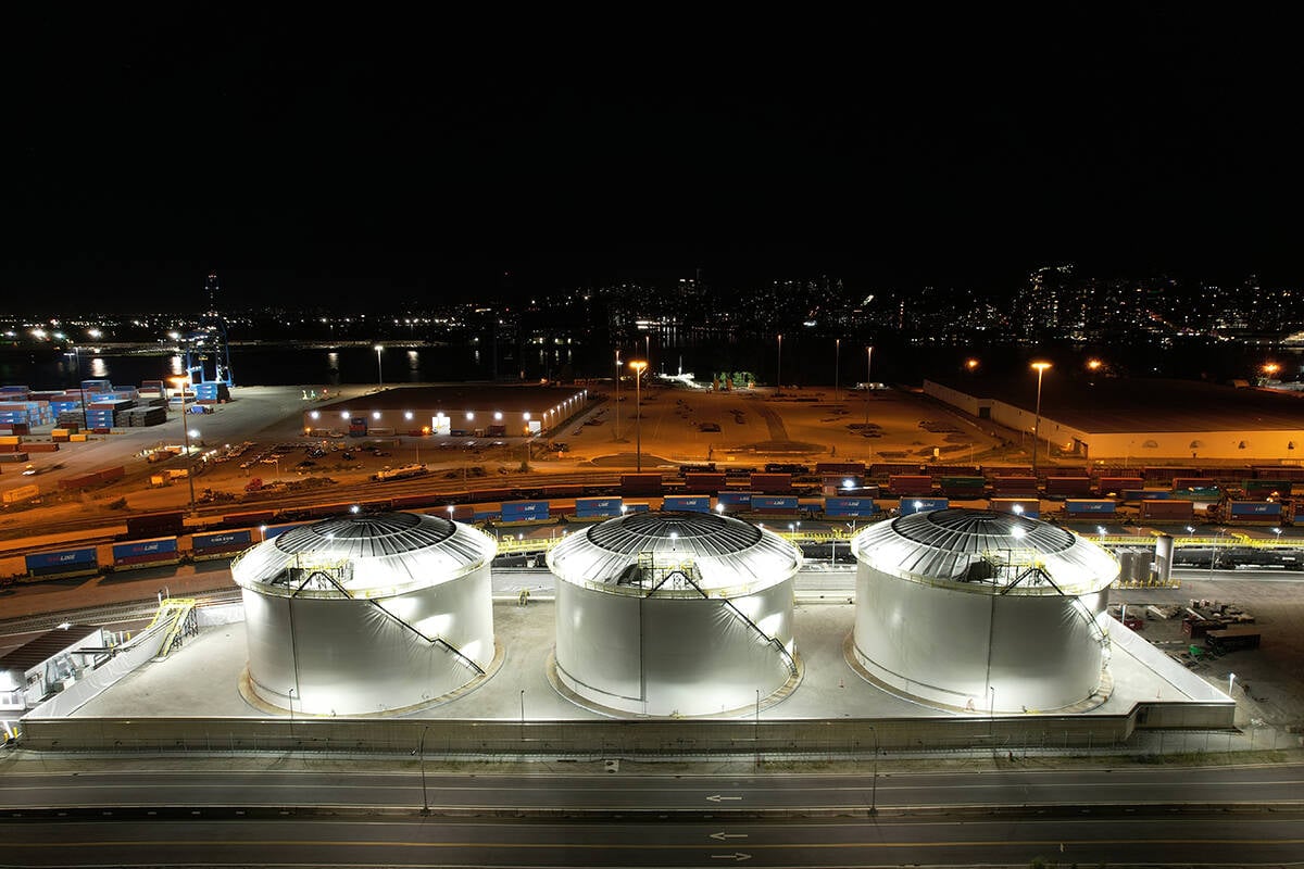
Canola oil transloading facility opens
DP World just opened its new canola oil transload facility at the Port of Vancouver. It can ship one million tonnes of the commodity per year.
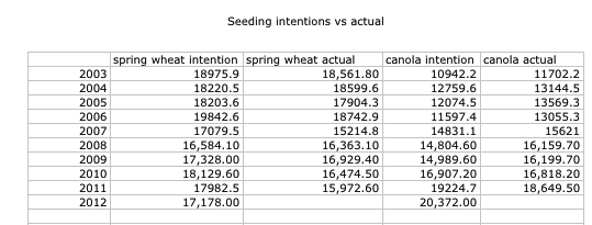
That’s really quite an incredible wheat-versus-canola story.
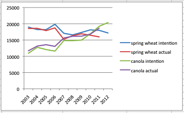
Want to know why hog producers are a little glum this spring? Looky here:
That’d make me glum if I was selling slaughter hogs. By the way, recall all the bearish blathering I’ve been doing about Chinese demand recently? That’s the source of the pain in this chart. China’s backed off buying so much pork recently. We’ve built a lot of Chinese demand growth into our price structure.
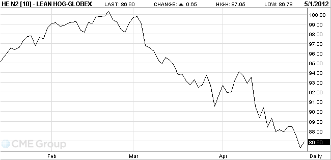
Want to feel both good and bad about the value of commodities from one chart? ScotiaBank’s commodity report recently ran this chart:
The top line makes it look like commodities rose in the 1970s, went flattish for about 20 years, then rose to today’s lofty levels. But line two shows what happens when you take inflation out of the equation: commodities are flat to down in the long term. Our recent high-price exuberance? Just a blip on the charts. The curving up of the line at the end is nice to see for commodity producers, but hardly as stunning as the non-adjusted chart above.
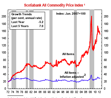
You don’t even need to extract inflation in order to make ag commodities look unpromising pricewise in the long run. Here’s another ScotiaBank chart:
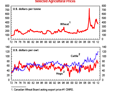
If anyone wonders why farmers have to continually expand their acreages and barns, buy bigger tractors and combines, and manage their production, finances and marketing far more intensively than in the past, there’s why. Over the long, long run, there’s no extra money in growing grains or producing livestock, so if you want to live with a contemporarily acceptable lifestyle, you need a bigger and bigger operation. And fewer and fewer neighbors. You’ve got to keep running as fast as you can just to keep up with the Red Queen, who isn’t getting any further ahead either.
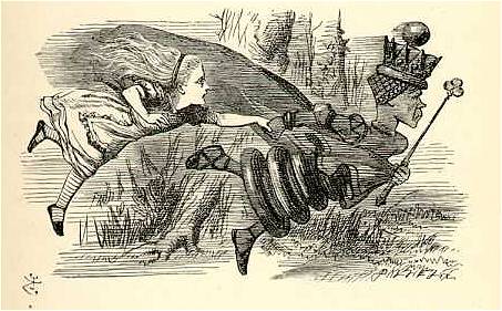
(Illustration by John Tenniel in 1871 version of Through the Looking Glass and What Alice Found There. The notion contained in this graphic gave me nightmares as a child. Futility, desperation, anxiety, pointlessness. But Alice succeeds in the end somehow, doesn’t she? That should give hope to us all.)