Take your newspaper’s classified sections from this week and from two weeks ago. Now turn them upside down and glance at the type.
Which appears easier to look at? Try reading the ads right way up. Which edition is better?
The “upside down” test helps show the difference in type, which was changed in response to readers. After we adopted a new Harris classified system, some readers said it was harder to read the ads.
The choices were to add more ink, increase the type size, or change the font (the type design). But more ink smears the pages, while bigger type would mean more pages and higher cost. The only logical option was to change the font. However, this was easier said than done.
Read Also
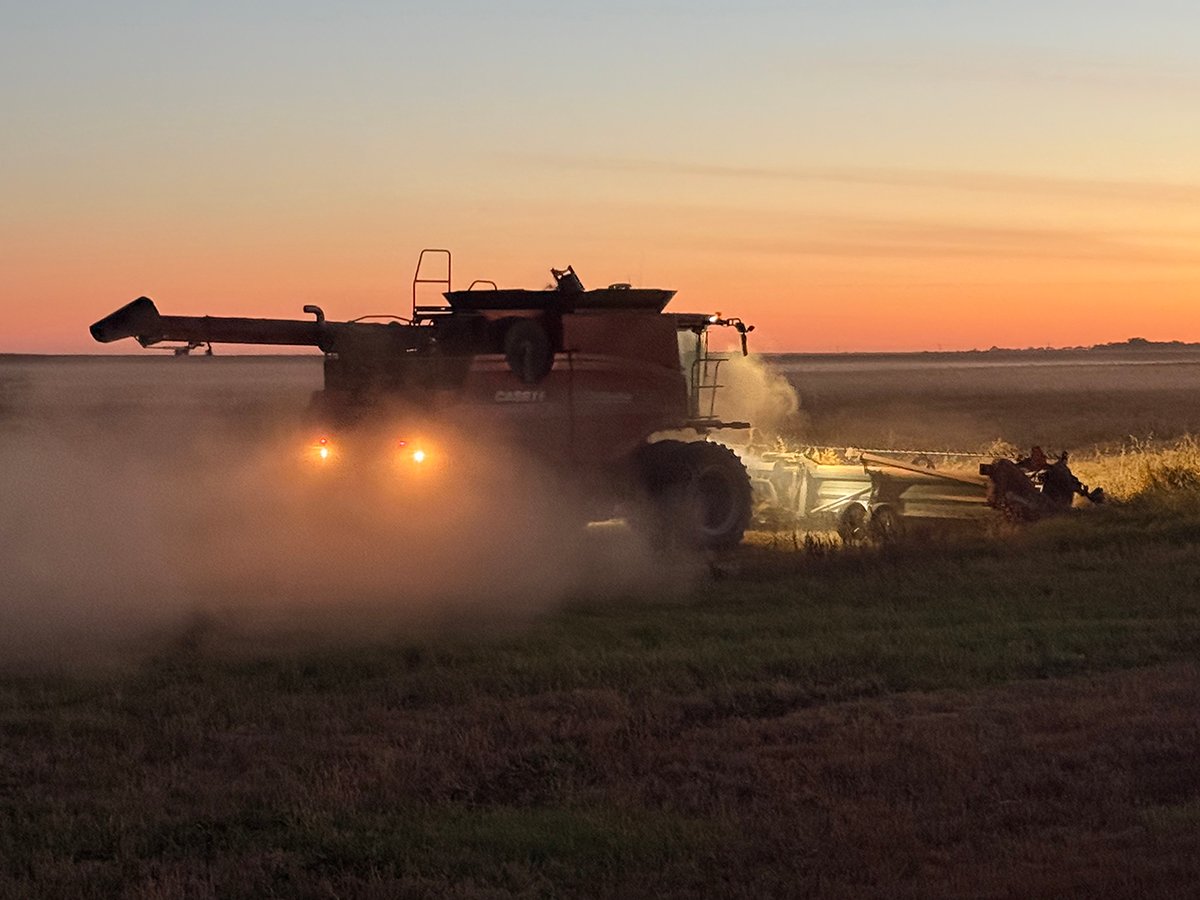
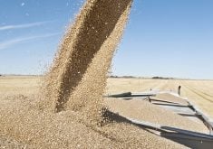
Downturn in grain farm economics threatens to be long term
We might look back at this fall as the turning point in grain farm economics — the point where making money became really difficult.
The new advertising system actually combines four computer systems: the terminals where text is entered; the server; the pagination system; and the Macintosh computers where display ads are produced. Changes done on one system must be translated into a form recognized by and compatible with the other systems.
Technical services manager James Haggarty said each of the computer systems were still being fine-tuned. Changing the fonts was just one of many changes that needed to be done.
“Technically, a font change shouldn’t have been that big of a deal, but because of the new system, fine-tuning a lot of the elements became part of the collective chaos,” he explained.
“It’s like a baby’s mobile on a bed. If you shorten one piece of it, it throws the whole mobile out of whack.”
A system analyst came from Florida recently to tune up the system and make the desired changes such as putting the ads in a bolder typeface.
The font makes numbers appear larger and easier to read. It’s called Bell Centennial — it’s the type used in many telephone books.