When you look at a page in our paper, what do you see first – story, headline, photo or graphic?
Newspapers often survey their readers to find out the answer to the above question. The more things that draw the attention of a reader, the longer the reader’s attention span to the page.
As lifestyles change, newspapers must compete with other things for people’s time. Design has changed over the years as journalists try different ways to continue attracting readers.
The studies on readers show that often it is the visual elements on the page that first capture their attention. This ranged from layout to style of graphics.
Read Also
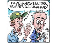
Downturn in grain farm economics threatens to be long term
We might look back at this fall as the turning point in grain farm economics — the point where making money became really difficult.
During the last five years, graphics have become an area our paper has increasingly developed and used. Recently we brought in consultant Val Cohen from The Orange County Register in California to teach us more about graphics.
Cohen stressed that the information appearing in a graphic must be there for a reason: “Make sure all marks are information you intend the reader to see. Take away things that aren’t getting information across but are diverting attention.”
Graphics come in many different forms – maps, charts, graphs, icons, breakouts, bullets, or tab charts. Sometimes they’re simply “text in a box” but if they help present the information in a more appealing way than a story can, they have served their purpose.
Roles graphics can play are: Location maps to show where a story is taking place; tracking different business trends; breaking down percentages into an easier digestible format; or identifying a package or continuation of stories in the paper.
Graphics can provide background for a story, streamline information from the story, or help break down stories with a lot of numbers and emphasize to readers why certain figures are important.