DAWSON CREEK, B.C. – When Peace River area photographer and book publisher Don Pettit was chosen to lead a team to design a Peace Country logo, his fear was logo by committee.
Instead, the group of graphic artists from across the Peace district seemed to understand the need for a simple, clear logo that wasn’t cluttered with too many ideas.
The group designed a simple aspen leaf logo that Pettit hopes will soon be recognized around the world as a symbol of Peace purity and excellence.
Read Also
Forecast leans toward cooling trend
July saw below average temperatures, August came in with near to slightly above average temperatures and September built on this warming trend with well above average temperatures for the month.
“It was really an exciting and creative process,” said Pettit, who wanted to create a logo that would fit on the side of a rail car or on a jar of honey, be easily recognizable and easy to reprint in black and white, one colour or full colour.
“We wanted something that was remarkably simple,” Pettit said.
While they took inspiration from local bridges, roads, rivers, antlers and northern lights, the designers wanted an image that was more literal and less symbolic.
They studied brands and logos from around the world for ideas, but always came back to the aspen leaf.
“It seemed the leaf was the answer.”
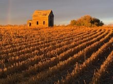
The aspen is common in northern forests, yet it can also be seen as a drop of water or a kernel of grain, Pettit said.
The use of local designers was consistent with the project’s homegrown theme, he said.
“It’s grown right here, just like the products.”